The iPhone 6 Plus Mini-Review: Apple's First Phablet
by Joshua Ho on September 30, 2014 8:00 AM EST- Posted in
- Smartphones
- Apple
- Mobile
- iOS
- iPhone 6 Plus
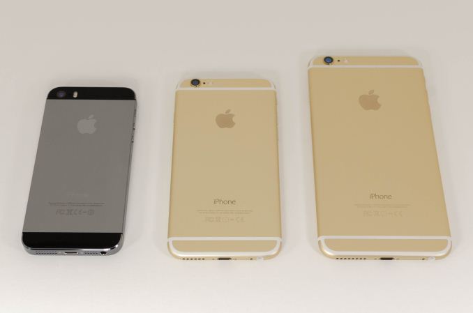
While we’ve also written about the iPhone 6, the iPhone 6 Plus needs its own review in order to really understand the various features of the device that would otherwise be buried in the context of the iPhone 6. Without question, this device represents a significant departure from the way Apple has competed in the smartphone space. Until now, Apple hasn't competed in the phablet space and has thus avoided competing with Galaxy Note line that has been established as the dominant phablet for the past 3-4 generations. As a result, Apple occupies a fast-follower position at best.
This brings us to the iPhone 6 Plus, which really is an extension of the iPhone 6. Both phones share the same SoC, NAND configurations, front and rear camera sensors, LED flash module, industrial/material design, TouchID home button, earpiece and speaker configuration, WiFi/BT chipset, modem, and button layout. At this point, I’m going to stop listing similarities because the iPhone 6 Plus is interesting for its differences. Unlike similarities, the differences are simple. The iPhone 6 Plus is bigger, the display has higher pixel density, the camera has optical image stabilization, and iOS 8 has new app designs to take advantage of the larger screen. The iPhone 6 Plus is also more expensive, with the 16GB version starting at the same price as the 64GB version of the iPhone 6.
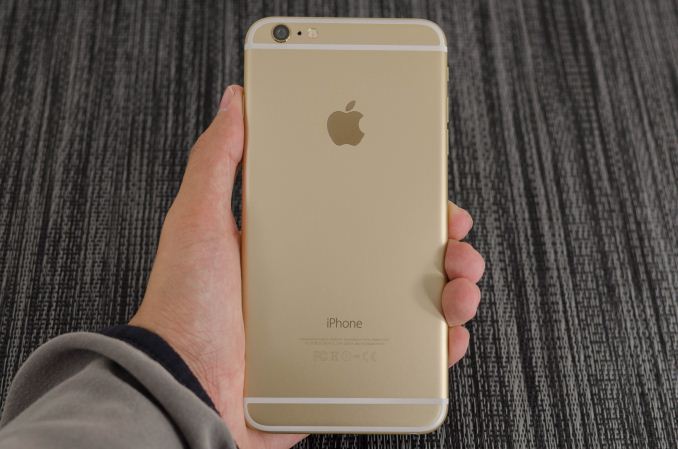
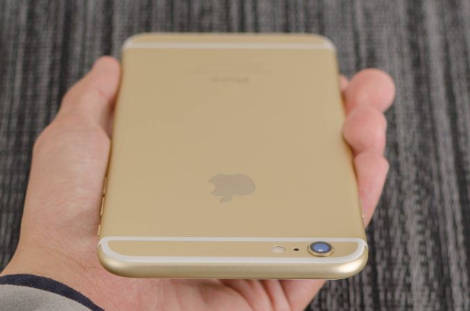
While I’ve already discussed the design of the iPhone 6, it’s important to see whether the same design translates to the iPhone 6 Plus. To this end, the iPhone 6 Plus does well. While the angular design of the iPhone 5 line would have looked and felt enormous in the hand, the shape is quite similar to the iPad line and is similarly comfortable in the hand, although the rounded edge really differentiates it, as does the control scheme. The only real issue here is that the top bezel on the front becomes surprisingly large, and this seems to contribute to a sense that the phone is top-heavy even though the phone is evenly balanced.
| Apple iPhone 5s | Apple iPhone 6 | Apple iPhone 6 Plus | |
| SoC | Apple A7 | Apple A8 | Apple A8 |
| Display | 4-inch 1136 x 640 LCD | 4.7-inch 1334 x 750 LCD | 5.5-inch 1920 x 1080 LCD |
| WiFi | 2.4/5GHz 802.11a/b/g/n, BT 4.0 | 2.4/5GHz 802.11a/b/g/n/ac, single stream, BT 4.0, NFC | |
| Storage | 16GB/32GB/64GB | 16GB/64GB/128GB | 16GB/64GB/128GB |
| I/O | Lightning connector, 3.5mm headset | ||
| Size / Mass |
123.8 x 58.6 x 7.6 mm, 112 grams |
138.1 x 67 x 6.9 mm, 129 grams |
158.1 x 77.8 x 7.1 mm, 172 grams |
| Camera |
8MP iSight with 1.5µm pixels Rear Facing + True Tone Flash 1.2MP f/2.4 Front Facing |
8MP iSight with 1.5µm pixels Rear Facing + True Tone Flash 1.2MP f/2.2 Front Facing |
8MP iSight with 1.5µm pixels Rear Facing + True Tone Flash + OIS 1.2MP f/2.2 Front Facing |
| Price |
$99 (16GB), $149 (32GB) on 2 year contract |
$199 (16GB), $299 (64GB), $399 (128GB) on 2 year contract |
$299 (16GB), $399 (64GB), $499 (128GB) on 2 year contract |
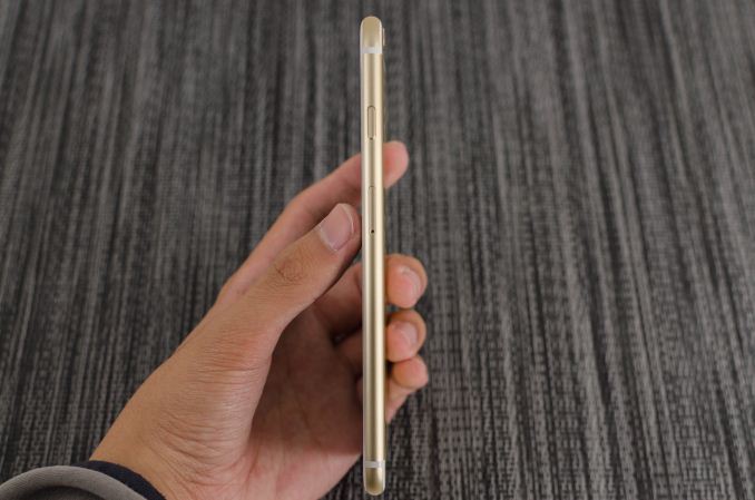
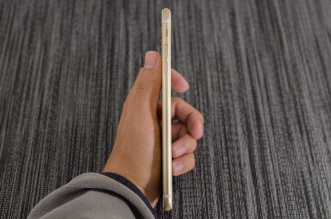
Overall, even though the iPhone 6 Plus is noticeably taller than the Galaxy Note 3 both feel similar in size. The iPhone 6 Plus is on the thinner side which makes a significant impression in the hand. At any rate, it’s physically impossible for me to use this device with one hand for most situations. It’s definitely a tablet in this sense, but in a much more compact and pocketable form factor.
"Bendgate"
Of course, drawing the comparison between the iPhone 6 Plus and Galaxy Note 3 inevitably raises the question of “bendgate”, which draws interesting parallels with “scuffgate” from the iPhone 5 generation. Unfortunately, I can’t destroy multiple review units in order to thoroughly investigate this issue. However, we can look at Consumer Reports’ data and come to a few conclusions about this problem. The first is that in the case of the iPhone 6 Plus, there appears to be an area near the bottom of the volume buttons that is a weak point as we see a clear failure of the casing in this area.
However, it seems that there is a significant amount of force needed in the first place in order to cause permanent deformation. Otherwise, everything that we’ve seen is primarily the result of fundamental differences between the two materials. It’s clear that in the case of the Galaxy Note 3 that a great deal of the structural rigidity is tied to the display itself, so the case doesn’t quite provide much in the way of protection as the polymer used is clearly in the elastic region all the way to failure. LG seems to have a different design though, as their polymer material has a clear case of brittle failure at the limit, which saved the display from shattering.
It's certainly possible to bend the iPhone 6 Plus (or really any phone or tablet), but the real issue here that hasn’t been addressed is the level of force needed to cause a certain level of elastic or plastic deformation in the material. This matters far more when discussing drop protection as the level of force in such a scenario is relatively small but applied over an extremely short period of time. There’s also no mention of force per unit area in any of these figures, so we can’t really have a serious discussion about this issue without the necessary data.




191 Comments
View All Comments
batongxue - Tuesday, September 30, 2014 - link
Oh, don't use this word. It's disgusting.5AppleCrappleHater2 - Tuesday, September 30, 2014 - link
Yeah sure:)Worship the holy apple.
The apple way, selling over expensive crap to stupid consumers that like to
get robbed.
This has been a disastrous launch in every respect. The iwatch is such an
ugly piece of crap, it is truly unbelievable how a company, formerly known for
its remarkable design, dares to put out such a crap ton of shit. Some
characteristics are glaringly obvious and inherent to it: over expensive,
hardly innovative, limited functionality and usability (need of an iPhone to
make it work), looks exactly like a toy watch and so on.
There are of course way better smart watches out there, especially from the
likes of Samsung, Sony, Motorola, Asus, LG, simply put, there is no need for
another piece of over expensive junk.
The iPhone 6 is technologically stuck in pre-2011 times, a base model with
a capacity of 16GB without the possibility to use SD cards isn't even funny
anymore. The screen resolution is horrendous, it isn't water proof, shock and
dust resistant, it offers nothing innovative, just some incremental
updates over its predecessor, both lacking severely behind their competitors at
their respective launch dates.
Now the Iphone 6 Plus offers a „Retina HD“ screen, full 1920x1080p, oh wow,
where have you been for the past 4 years apple, talk about trailing behind.
That’s pathetic. The interesting thing about that is the fact that apple
always manages to sell backwards oriented, outdated crap to its user base, all
while pretending to be an innovative technology leader. The similarities
regarding any form of sectarian cult are striking.
You gotta love how Apple always comes up with new marketing bullshit terms,
aka "Retina HD", with the intention to manipulate its users while preventing easy
comparisons with its competitors by withholding the actual specs. Apparently it’s
not enough to have a 1080p screen, you have to call it "Retina HD" to make those
suckers buy it, otherwise someone could look at the 4K Amoled and Oled screens
form LG and Samsung devices and get outright disappointed. Same goes for
everything else. Every outdated „feature“ needs to get its own marketing label
to persuade buyers with crappy „experience“ and „usability“ ads, while covering
the truth with marketing gibberish, knowing full well that only a fraction of
aforementioned buyers cares to look at the facts and dares to compare them.
Car engines come to mind. For comparisons shake let’s look at a 1.0 liter, turbo
charged petrol engine and a V8 compressor. What’s better should be obvious, but
by calling the former an „ecobooster“, thus giving it a special marketing label,
this joke becomes a „feature“, something positive that can be added tot the list
of features of a car.
By doing so a negative aspect is transformed into a positive one, the
reality is distorted, non tech savvy buyers are manipulated and comparisons are
made more difficult (another layer of marketing bullshit to overcome), well done
marketing department. You see , if something is seriously lacking (of course for
profit, what else), don’t bother explaining, just give it a nice marketing term, distort
reality, make it a feature and call it a day. Fuck that!!
FACT: Apple has been forced to copy Android in style and size for
years because people abandoned their tired, moribund and fossilized
devices for superior and innovative Android devices.
Steve Jobs said no one should want a 7" tablet until everyone went and bought
Android devices forcing Apple to copycat with the iPad Mini. Apple
didn't think anyone wanted a phone screen larger than a business card
until they all bought Androids thus forcing the arrival this week of the
iPhone Galaxy and iPhone Galaxy Note clone phones.
Swipe down notifications that don't interfere? Copied from Android and WebOS. Siri?
Bought and ruined from a private developer; Google Now crushes it.
3rd-party keyboards? Welcome to 2010, iChumps! Widgets? Welcome to 2009
except you can't place them on your home screen. Live wallpapers and
hidden icons? Maybe Apple will get around to copying those in iOS X in
2016. Who knows.
Apple lacks creativity and honest people acknowledge it. Steve Jobs gets credited as an
innovator when all he was, was a huckster who'd spot someone else's tech, polish it up nicely,
then slap a gnawed fruit logo on the back, charge a premium price and
wait for the rubes like Jim Smith to hand over their cash like the good
iSheep they are.
But after that initial iteration, Apple is incapable of actually innovating something new.
They literally cannot make a product until someone else shows them how and they copy it.
They are also unable refine things because they believe to improve is to
admit something was imperfect the first time. (This is why QuickTime 4
had a legendarily terrible UI that was never changed through QT7 a
decade later.) All they can do is make things incrementally thinner or
faster but it's just minor refinements since they can't invest their way
out of a wet paper bag.
For all their squealing about Retina displays, they never even had a HD display until now;
8th time is the charm, though you need the iPhone Galaxy Note to get the 1080p that many Android
users have had for at least a year and is now considered
bare-minimum spec. At the rate Apple drags along, QHD screens should
arrive in 2018. Maybe. A graphic went around after the reveal comparing
the iPhone Galaxy to the Nexus 4 from 2012. Exactly.
The Apple Iphone 1 and Ipad 1 might have been innovative at their time,
but since then, the bitten apple has been continuously rotting from the inside
outwards, always swarmed by millions of Iworms which regale themselves with its
rotten flesh, not forgetting all other Americans who support apple by means of
their tax dollars to finance its bought US Treasury/Government bond interest rates.
Last but not least, every Apple product includes a direct hotlink to the NSA,
free of charge, something that might make it a good value, after all.
Ceterum censeo Applem esse delendam.
Pabloss - Tuesday, September 30, 2014 - link
I tried using Galaxy S3. I really tried. On paper it has everything better -- better screen, better processor, more memory, better camera. A bit like Windows PC -- better processor than Mac, better graphics card, more memory, etc. And then you start using that thing and it crashes. The screen goes black every time you want to click on a number on the keypad. Skype drops calls. To get anything working you need to configure stuff. Install stuff. Yes the hardware is better, At least 33% better. And the software is 90% worse. Why to have a better processor when sliding animation has hiccups when I can have apparently worse hardware with software where sliding just works. I think "just works" is something that Samsung, Android, etc. just don't get. They advertise features bt then you can't even make a call. Because stupid screen goes black. And don't even get me started on the customer service. Samsung customer service compared to Apple's is just none. Zero. Nada.Android devices are like Porsche 911 (hardware) with horrible driver (software). Apple is more like a bit worse hardware (i.e. Porsche Boxster) with fantastic driver (Schumacher). Guess what at the end of the day Schumacher wins the race!
matt101 - Tuesday, September 30, 2014 - link
I don't understand where people get the idea from that android is buggy. My moto G, which is not exactly a high end phone barely ever crashes and reportedly ios actually has more crashes than androidbeck2050 - Wednesday, October 1, 2014 - link
Exactly! I've had a note 3 for a year of hard duty with no problems at all. Fast and reliable, never crashes. Everything works. Android is from Linux so it functions well. The Note 4 looks awesome, no worries about bending, maps, voice translators, or any of the myriad problems Apple has with its first generation products. I don't care what brand, at the moment Note 4 is the best. BTW I've had a slew of Mac computers.akdj - Thursday, October 2, 2014 - link
I've also got the Note 3. And I'm an iPhone user. The 5s for personal and Note for our business. I love the N3 but I owned the Note 1, begged my way out ( terrible, slow and HORRIBLY buggy UI & hardware). But bought the three. Love it. But it took a while. As a user of both the 5s&N3 fir a year though, it's hard to believe how much 'slicker' the Iphone is. A third the RAM. ½ the processors, clocked at ½ the speed and Asphalt 8 on both, the iPhone lays waste to my Note when it comes to fluency and 'speed'.Not that the N3 is a slouch but hold on the '4' til we see some data. Indreasing to the 500+PPI zone doesn't help battery life and I'm not sure the GPU power in the SoCs are up to the task in TouchWiz at this point. A dry reboot on my Note and within 30 seconds its eating 2.1+GB RAM! That's insane. And while it's definitely fast and reliable ...and I've not had many 'crashes', there's a huge upside to iOS. And that's the lack of Samsung and AT&T or Verizon bloat. A phenomenal Eco system (I'm a pilot and the second gen mini has replaced my flight bag and kneeboard, damn near 50 pounds on a Beechcraft twin!) for everyone regardless of your tastes, hobbies, or interests.
The 'Play Store' while many routine apps I've got in parity, it's lacking HUGE in creativity, photo and video manipulation, artistry and gaming. Productivity apps like MSOffce or the iWork suite (I've got Docs Pro and several others!), or utilities for carpentry, automotive ...including a BOOMING 3rd party, cottage industry with a MASSIVE amount of peripherals!!! If you're into automotive, your iPhone can plug directly into your vehicle's computer and tune it the way you'd like. I use a GPS dongle that cost about a tenth of what I paid five years ago for similar FAA certified avionics.
Anyway, I guess that's my BIGGEST bitch about my N3. Lack of software. I only look at the UI for a second or two when the phone's on. Then I'm inside an app. Same on the tablets and that's where I feel the weakness is with the 'phablet' sized Android phones. As there are very few tablet optimized apps on Android other than blown up phone UIs, the Note is close, and the 'lack of interest' by the developing folks in that area sucks. iOS on the other hand sports killer apps and a half million give or a take few thousand optimized for one, the other and often both.
As well ...the Note isn't always 'comfortable'. It's big, like the iPhone six plus but it's also thick. There's a significant difference in 'feel' between the two. Hard to explain if you've not held one but I've thought a few times about changing my order :)
theduckofdeath - Monday, October 6, 2014 - link
It's not a bonus too have to pay twice for the same app as you have to do on ios if you have a phone and a tablet. Android apps scale intelligently to screen size. Stop praising a huge design failure as an advantage, Apple users.kevin_newell - Thursday, October 9, 2014 - link
Apple has just gotten way to far behind it's competitors in terms of innovation (for example large screens and phone cameras that work well in low light is old news) and user satisfaction (see http://www.consumertop.com/best-phone-guide/ for example).akdj - Wednesday, November 12, 2014 - link
Apparently not much knowledge you hold there when it comes to iOS eh?Most apps functional on the iPad and iPhone are the same app, price, and put it on as many phones, iPods, pads, mini or maxi...doesn't matter.
No need to 'pay twice'. That went away a long time ago. There's still a couple apps that continue this model but they're few and far between. You apparently didn't read anything I actually posted, so again...as an owner of BOTH Android (Note 3) & iOS (iPhone 6+ & iPads aplenty, Nexus 7.1 & .2, original Xoom and a ½ dozen other unmemorable units collecting dust).
When it comes to tablet, ph able or 'large' display apps and software, NOT phone sized UIs, iOS SMOKES Android's pathetic tablet and phablet market! Just. Destroys. It.
That said, TWiz for the hate it gets actually DOES offer OEM provided software to make use of the display, digitizer and a ½ dozen slick, note taking apps. After that, I have just as good luck and a smoother experience using a $2 stylus on the iPad with Autodesk, VooDoo Pad and the ilk
Anything creative ...photography, videography, art (draw, sketch, paint, CAD or home design, the list goes on forever)--- to media, it's organization and delivery...ease of use by family members even before family sharing ...CERTAINLY no reason to 'buy an app or pay twice'...
...as usually I find the iOS 'version' even if it's a Google App! ...to be more functional, fluent and 'capable' than I do on my Android with double to cores @ twice the clock speed and three times the RAM (2.1 GB being used immediately from a cold start and JUST by running carrier and OEM bloat in the background you, me, nor anyone I know, needs!)
Users of technology that don't get it ....
Narg - Wednesday, October 1, 2014 - link
Android is buggy, very buggy. Also, it's the only mobile OS right now that is riddled with malicious software and viruses. All because of those bugs. It's a side effect of the open architecture. Open is great for some, but for most it's a bad thing, very bad in the case of a SmartPhone.I support hundreds of users and their devices. I get calls 10 times more often on Android phones than I do on iPhone or Windows Phones. Yes, android is buggy.