The iPhone 6 Review
by Joshua Ho, Brandon Chester, Chris Heinonen & Ryan Smith on September 30, 2014 8:01 AM EST- Posted in
- Smartphones
- Apple
- Mobile
- iPhone 6
With every launch of the iPhone, Apple seems to have everything to lose and not much to gain. Apple’s iPhone line accounts for the majority of profits in the smartphone space, and as the smartphone market marches towards maturity it seems inevitable that companies like Xiaomi will be able to deliver largely similar experiences at much lower prices. The same once happened with Apple in the days of the PC industry where Apple approached irrelevance. Yet generation after generation, Apple seems to be able to hold on to a majority of profit share, and they’ve managed to tenaciously hold on to their first-mover advantage.
This brings us to the iPhone 6. This is now the eighth generation of the iPhone, and the fifth generation of the iPhone’s industrial and material design. We should note right now that this review is specifically for the iPhone 6; for the iPhone 6 Plus, please see our iPhone 6 Plus companion review. At this point, it’s not really possible to revolutionize the smartphone, and on the surface, the iPhone 6 seems to be directly inspired by the iPod Touch. However, instead of the chamfered edge where the display meets the metal unibody we see a continuous curve from the sloping glass to the metal unibody that looks and feels great. While the M8 was one of the best phones for in-hand feel, the iPhone 6 goes a step further due to the reduced weight and rounded side. I've always felt like the HTC 8X had one of the most compelling shapes for a phone, and the incredibly thin feel of the iPhone 6 definitely reminds me of that.
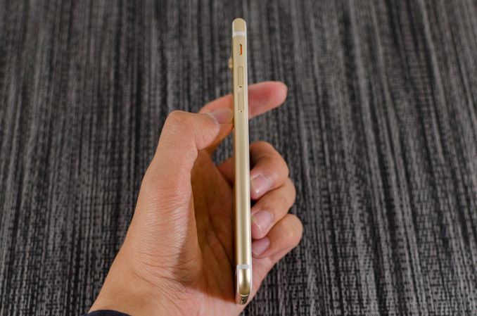
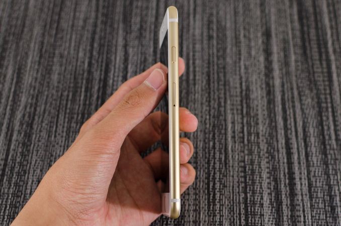
Along the left side, we see the standard volume buttons and mute switch that continue to have the same solid feel and clean clicking action. As I discuss in the iPhone 6 Plus review, going by Consumer Reports' data it seems that there is a weak point near the bottom of the volume rocker, although it's far less likely to be an issue on the iPhone 6 due to its smaller size. Along the top, there isn’t a power button because it’s been moved to the right side of the phone so there’s nothing notable on the top.
On the right side, we see the previously mentioned power button and also the SIM tray, which is ejected by inserting a pin into the eject hole. Similarly to the volume buttons, the power button has a solid feel that gives a distinct click when triggered and continues to be quite unique when compared to phones other than recent iPhones.
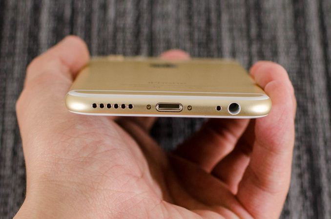
The bottom has the Lightning connector, speaker, a microphone, and 3.5mm headset jack. The placement and design of all these elements are largely similar if not shared directly with the iPod Touch.
The back of the phone continues to share elements from the iPod Touch. The camera, microphone, and LED flash are almost identical in their appearance, even down to the camera hump’s design. The LED flash does look different to accommodate the second amber flash, but the shape is identical. The only real difference is that the antennas of the iPhone 6 are the metal pieces on the top and bottom, with the associated plastic lines instead of a plastic RF window.
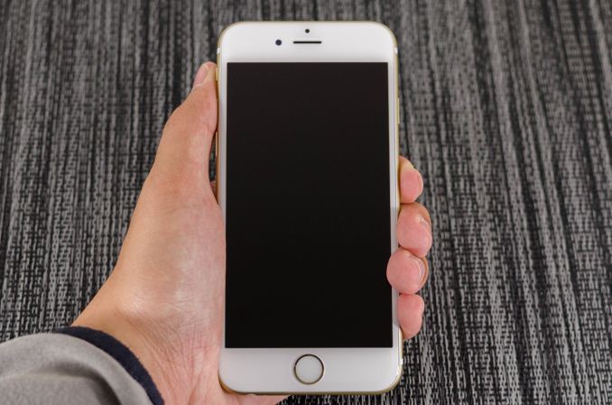
The front of the phone is decidedly more similar to the iPhone 5s though, with the Touch ID home button. While the earpiece hasn’t moved, it seems that the front facing camera has been moved back to the left side of the earpiece, and the sensors for light and proximity are now above the earpiece. For the most part, there’s not much to comment on here but after using the iPhone 6 for an extended amount of time I’m definitely sure that the home button is relatively closer to the surface of the display glass than before. In addition, the home button has a dramatically improved feel, with short travel, clean actuation, and a reassuring click in most cases.
Overall, while I was undecided at the launch of the iPhone 6 I definitely think the look of the new iPhone has grown on me. The camera hump’s accent serves as an interesting design touch, and the feel of the design is definitely much more comfortable and ergonomic than before. I’m not really sure that the extra reduction in thickness was necessary, but it does make for a better first impression. In the launch article I was a bit surprised that Apple chose to have a camera hump but given the fact that the iPod Touch has the same design it seems that there is precedent for such a move. I personally feel that the design wouldn’t be worse by increasing thickness to eliminate the hump and improve battery life as a result.
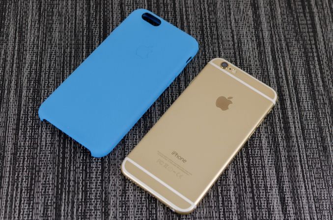
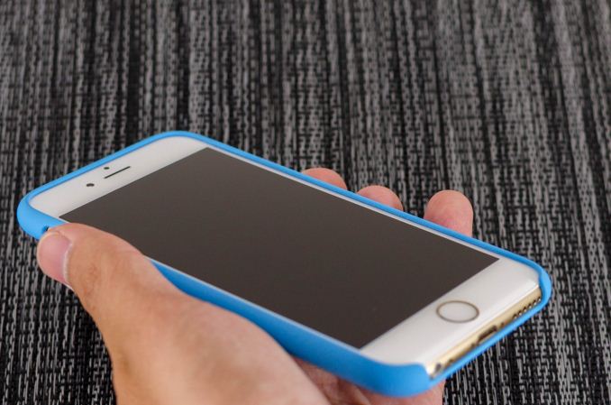
Apple has also introduced a new silicone case, which brings a lower price point than the leather cases. Surprisingly, this is a rather high quality case, and as far as I can tell it doesn’t carry any of the issues that silicone cases traditionally have. There’s a nice lip to make sure that the display glass doesn’t touch a surface if the phone is put face down, and the material doesn’t seem to stretch or attract pocket lint the way most silicone cases do.
There’s definitely a lot more to talk about though, and to get a sense of the major differences I’ve put together our usual spec table below.
| Apple iPhone 5s | Apple iPhone 6 | Apple iPhone 6 Plus | |
| SoC | Apple A7 | Apple A8 | Apple A8 |
| Display | 4-inch 1136 x 640 LCD | 4.7-inch 1334 x 750 LCD | 5.5-inch 1920 x 1080 LCD |
| WiFi | 2.4/5GHz 802.11a/b/g/n, BT 4.0 | 2.4/5GHz 802.11a/b/g/n/ac, single stream, BT 4.0, NFC | |
| Storage | 16GB/32GB/64GB | 16GB/64GB/128GB | 16GB/64GB/128GB |
| I/O | Lightning connector, 3.5mm headset | ||
| Size / Mass | 123.8 x 58.6 x 7.6 mm, 112 grams | 138.1 x 67 x 6.9 mm, 129 grams | 158.1 x 77.8 x 7.1 mm, 172 grams |
| Camera |
8MP iSight with 1.5µm pixels Rear Facing + True Tone Flash 1.2MP f/2.4 Front Facing |
8MP iSight with 1.5µm pixels Rear Facing + True Tone Flash 1.2MP f/2.2 Front Facing |
8MP iSight with 1.5µm pixels Rear Facing + True Tone Flash + OIS 1.2MP f/2.2 Front Facing |
| Price | $99 (16GB), $149 (32GB) on 2 year contract | $199 (16GB), $299 (64GB), $399 (128GB) on 2 year contract | $299 (16GB), $399 (64GB), $499 (128GB) on 2 year contract |
As you can see, this is a major release even at a high level. While the design might take some inspiration from the iPod Touch, the hardware is a completely different beast. There’s a new SoC, the A8; the iPhone 6 also includes a bigger and better display, newer WiFi module, bigger battery, and a better camera. Of course, there’s a lot more to the story of the iPhone 6 than a spec sheet. The first major difference that we’ll talk about is the SoC.




531 Comments
View All Comments
bobobobo - Tuesday, September 30, 2014 - link
solid phone, solid improvement.AppleCrappleHater2 - Tuesday, September 30, 2014 - link
Worship the holy apple.The apple way, selling over expensive crap to stupid consumers that like to
get robbed.
This has been a disastrous launch in every respect. The iwatch is such an
ugly piece of crap, it is truly unbelievable how a company, formerly known for
its remarkable design, dares to put out such a crap ton of shit. Some
characteristics are glaringly obvious and inherent to it: over expensive,
hardly innovative, limited functionality and usability (need of an iPhone to
make it work), looks exactly like a toy watch and so on.
There are of course way better smart watches out there, especially from the
likes of Samsung, Sony, Motorola, Asus, LG, simply put, there is no need for
another piece of over expensive junk.
The iPhone 6 is technologically stuck in pre-2011 times, a base model with
a capacity of 16GB without the possibility to use SD cards isn't even funny
anymore. The screen resolution is horrendous, it isn't water proof, shock and
dust resistant, it offers nothing innovative, just some incremental
updates over its predecessor, both lacking severely behind their competitors at
their respective launch dates.
Now the Iphone 6 Plus offers a „Retina HD“ screen, full 1920x1080p, oh wow,
where have you been for the past 4 years apple, talk about trailing behind.
That’s pathetic. The interesting thing about that is the fact that apple
always manages to sell backwards oriented, outdated crap to its user base, all
while pretending to be an innovative technology leader. The similarities
regarding any form of sectarian cult are striking.
You gotta love how Apple always comes up with new marketing bullshit terms,
aka "Retina HD", with the intention to manipulate its users while preventing easy
comparisons with its competitors by withholding the actual specs. Apparently it’s
not enough to have a 1080p screen, you have to call it "Retina HD" to make those
suckers buy it, otherwise someone could look at the 4K Amoled and Oled screens
form LG and Samsung devices and get outright disappointed. Same goes for
everything else. Every outdated „feature“ needs to get its own marketing label
to persuade buyers with crappy „experience“ and „usability“ ads, while covering
the truth with marketing gibberish, knowing full well that only a fraction of
aforementioned buyers cares to look at the facts and dares to compare them.
Car engines come to mind. For comparisons shake let’s look at a 1.0 liter, turbo
charged petrol engine and a V8 compressor. What’s better should be obvious, but
by calling the former an „ecobooster“, thus giving it a special marketing label,
this joke becomes a „feature“, something positive that can be added tot the list
of features of a car.
By doing so a negative aspect is transformed into a positive one, the
reality is distorted, non tech savvy buyers are manipulated and comparisons are
made more difficult (another layer of marketing bullshit to overcome), well done
marketing department. You see , if something is seriously lacking (of course for
profit, what else), don’t bother explaining, just give it a nice marketing term, distort
reality, make it a feature and call it a day. Fuck that!!
FACT: Apple has been forced to copy Android in style and size for
years because people abandoned their tired, moribund and fossilized
devices for superior and innovative Android devices.
Steve Jobs said no one should want a 7" tablet until everyone went and bought
Android devices forcing Apple to copycat with the iPad Mini. Apple
didn't think anyone wanted a phone screen larger than a business card
until they all bought Androids thus forcing the arrival this week of the
iPhone Galaxy and iPhone Galaxy Note clone phones.
Swipe down notifications that don't interfere? Copied from Android and WebOS. Siri?
Bought and ruined from a private developer; Google Now crushes it.
3rd-party keyboards? Welcome to 2010, iChumps! Widgets? Welcome to 2009
except you can't place them on your home screen. Live wallpapers and
hidden icons? Maybe Apple will get around to copying those in iOS X in
2016. Who knows.
Apple lacks creativity and honest people acknowledge it. Steve Jobs gets credited as an
innovator when all he was, was a huckster who'd spot someone else's tech, polish it up nicely,
then slap a gnawed fruit logo on the back, charge a premium price and
wait for the rubes like Jim Smith to hand over their cash like the good
iSheep they are.
But after that initial iteration, Apple is incapable of actually innovating something new.
They literally cannot make a product until someone else shows them how and they copy it.
They are also unable refine things because they believe to improve is to
admit something was imperfect the first time. (This is why QuickTime 4
had a legendarily terrible UI that was never changed through QT7 a
decade later.) All they can do is make things incrementally thinner or
faster but it's just minor refinements since they can't invest their way
out of a wet paper bag.
For all their squealing about Retina displays, they never even had a HD display until now;
8th time is the charm, though you need the iPhone Galaxy Note to get the 1080p that many Android
users have had for at least a year and is now considered
bare-minimum spec. At the rate Apple drags along, QHD screens should
arrive in 2018. Maybe. A graphic went around after the reveal comparing
the iPhone Galaxy to the Nexus 4 from 2012. Exactly.
The Apple Iphone 1 and Ipad 1 might have been innovative at their time,
but since then, the bitten apple has been continuously rotting from the inside
outwards, always swarmed by millions of Iworms which regale themselves with its
rotten flesh, not forgetting all other Americans who support apple by means of
their tax dollars to finance its bought US Treasury/Government bond interest rates.
Last but not least, every Apple product includes a direct hotlink to the NSA,
free of charge, something that might make it a good value, after all.
Ceterum censeo Applem esse delendam.
esterhasz - Tuesday, September 30, 2014 - link
Since we're quoting Cato today, here's a good one: "grasp the subject, the words will follow".uhuznaa - Tuesday, September 30, 2014 - link
You seem to be a tiny bit obsessed.iphone6splus - Tuesday, September 30, 2014 - link
Yet, he didn't comment on Touch ID.kevin_newell - Thursday, October 9, 2014 - link
Apple is lagging far behind it's competitors both in user satisfaction (source: http://www.consumertop.com/best-phone-guide/) and innovation. I mean, who was first with large screens and phone cameras that work well in low light? It sure wasn't Apple.Caliko - Tuesday, October 6, 2015 - link
A large iPhone is NOT innovation.Sorry iPhoney fan.
lowtolerance - Tuesday, September 30, 2014 - link
I can recommend some good therapists. You need one.melgross - Tuesday, September 30, 2014 - link
You sir, are a complete idiot!Gondalf - Tuesday, September 30, 2014 - link
To be fair, a >$600 phone deserves a good LCD.....at least good as competitors, more ram and a little SD expansion slot. Plain and simple. This is not a matter of "idiocy"